Evaluation on Prezi
Wednesday 23 March 2011
Friday 4 February 2011

Thursday 3 February 2011
Our Invite

Wednesday 2 February 2011
Before & After Poster Production


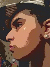
- We decided to try and imitate it so we got Rhiannon to pose with a pen under her tongue to lift it.
- In photoshop the pen was then taken out, replaced with an image of a syringe which pierced through Rhiannon's tongue, her face was coloured greyish to give the dead look. By using the burn tool we were able to give her bruises on the sides of her face to look like she had been attacked and we added blood drops to complete the look.
- The final product.
Sunday 23 January 2011
Redemption - Poster

Inspiration sprung from the SAW movie posters, the use of mainly one image to cause a lasting impression . Using a bright background firstly draws attention to the poster itself and the image which takes up most of the poster. The font is a graphic style and the writing looks like it is written in blood which goes with the theme of the SAW franchise. The colours used are minimal to create a dull and cold feel which connotes death, this is why we decided to highly saturize our own poster. The SAW poster here is actually a teaser poster which does not have the general information usually found on a full movie poster, even though we constructed a teaser trailer, we stuck to the brief and included all the information needed that is not shown on the teaser poster. The needles through the tongue was found by all three of us browsing for pictures of syringes and we chose to imitate this picture as it made us all cringe and I think it was a good way of implimenting the Hypodermic Needle Theory. To imitate the SAW font I went on dafont.com and browsed 'Distorted' fonts, this is because our Villain distorts his victims by injecting them with his own blood, this is also why we emulated the picture from google as a needle through a tongue is personal and looks painful. The colour used is brown, it looks red, we were going for the dried blood look and the font also has a sort of splatter around it which looks like the wiping of blood on it.

Saturday 22 January 2011


Tuesday 18 January 2011

Subscribe to:
Posts (Atom)